 It's conveniently located 1/2 a block from our hotel.
The museum has 6 floors, each floor having a designated style or category of art. Our first stop was Contemporary Art. When do you think the Contemporary Art period starts? It starts in 1965. That's astonishing when you think that art which is 40 years old is still considered contemporary. But look at the Andy Warhol Campbell's soup cans. People are still fascinated by the art that came out of The Factory and the art of the 60's in general still looks fresh and new.
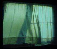 This piece tickled me. It's an image of an open window with curtains projected onto a wall. You see an image of the wind blowing the curtain out...
 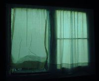 and then sucking the curtain back into the screen.
We've all seen this happen many times and it's such a tactile experience, but then to see an image of what you've experienced in daily life, and to have the same sense memory even though there is no window, no curtains, and there is no wind, just an image projected onto a white wall in the dark, was interesting. You experience the same sensation even though it's only an illusion.
 Here is another one that I liked. It was done by an American, Tom Wesselmann, (born 1931-Deceased 2004) in 1963 called, "Still Life #30." It such a slice of Americana with its Rice Krispie cereal, Dole sliced pineapple, 7-Up soda, hot dogs, pancakes, checkered tablecloth, pink fridge etc. It makes me want to see Still Life 1 through 29.
There was also a video installation on this floor (that didn't make sense to photograph) which showed a girl brushing her hair over and over again and the words that appeared on the screen were "Art has to be beautiful. Artists have to be beautiful."
Oh and I also have to share my experience with this one art installation. You walk into a narrow passageway where it is so dark you can't see your hand in front of your face. I went in there pushing Astrid in her stroller and I literally bumped into a wall. Yes, at the end of it was a wall. If you looked to the side you saw a faintly lit purple light. That was it. Can you tell it annoyed me? At least have something interesting to look at if you make me go down a narrow, twisting hallway where I can't see where I'm going and I bump into a wall.
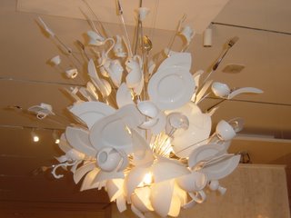 I saw this chandelier on the Architecture and Design floor. This piece was done by a German named Ingo Maurer (born 1932) in 1994 and the piece is called "Porca Miseria! Chandelier." It's made of broken plates, bowls, cups, vases, forks, and spoons. I would love to have a chandelier like this hanging above my dining room table. Talk about a conversation piece.
 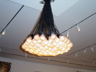 Here's another interesting chandelier. It was made by a Dutchman named Rody Graumans (born 1968) in 1992 and is called, "85 Lamps Lighting Fixture."
Other pieces of "art" on this floor included a rubics cube, a collection of pouring devices (I'm not kidding) and furniture that looked on par with Ikea.
I was disappointed by the lack of architectural pieces on this floor. They had a couple miniature models (not impressed) and this piece with different colored metal shelves (pretentious) that looked like something you'd have in the garage to store tools, which took up a lot of room.
 MOMA itself is beautifully designed. Here's a photo I took of the stairs that you can see from the opposite side of the building. Doesn't it look like it could be an art installation?
 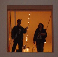 And here is a cutout in a wall with a glass pane. When people stand on one side of it, it looks like a painting when you look up at it.
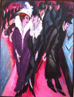 And I love love love this painting. It was done by a German artist, Ernst Ludwig Kirchner (born 1880 - deceased 1938) in 1913. The painting is called, "Street, Berlin."
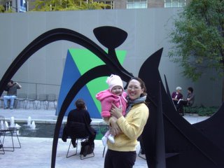 Here we are standing in front of a sculpture in MOMA's outdoor sculpture garden.
Although I'm glad I went, I don't think I'll go again with Astrid to a museum until she's older (or Uwe goes with us). We were standing in front of an art installation showing a rabbit flayed open and decomposing. I'm sure the artist intended for it to be profound, especially since it was in a dimly lit room. Right then Astrid burst into laughter and I had to wheel her out of there fast before I got stoned by the other viewers. I ended up holding her most of the time as she got tired of sitting in her stroller, and there weren't a lot of places to sit, so it was tiring for me as well. MOMA also has an audio device which is handheld but it wasn't possible for me to listen as my hands were full holding Astrid and pushing the stroller.
But I love this last photo of Astrid. She looks so cute in her fleece jacket and snow hat.
And I'm glad it was possible for us to visit MOMA in NY together. Her first museum at age 6 months. Not bad at all.
2 comments:
That museum looks fun! I'm not a big art person, because I never understand what the artist is trying to portray, but I still like looking.
Great post!
I really enjoy visual inspiration like the one in this pieces!!
This work remembers me the brand Delightfull, I discovered it, while I was seeing some blogs, You Will Enjoy it to!
Delightfull is a brand taht makes the perfect mix between 40’s, 50’s and 60’s music legacy and lighting pieces!
Visit www.delightfull.eu or www.youtube.com/DelightfullLighting and by the way visit also www.bocadolobo.com. They have beautiful luxury timeless pieces!
I really enjoyed your blog.
I’ll come back to see what you post next!
Post a Comment